| Industrial Earnings Are Strong |
| By Price Headley |
Published
05/9/2011
|
Currency , Futures , Options , Stocks
|
Unrated
|
|
|
|
Industrial Earnings Are Strong
One or two losing days is tolerable. It happens. Four straight losers though, and with Friday nearly being the fifth? Not fun, and not encouraging for the bulls. Worse, there’s still plenty of room for the bears to keep chipping away.
We’ll compare the market’s upside and downside below. Let’s start at the top with the economy though, and work our way into an analysis of the S&P 500 Index (SPX) (SPY).
Economic Calendar
Last week was a huge one for economic data, with most of it coming on the jobs front. Here are the highlights:
* Employment continues to be a mixed blessing, with a positive spin being put on even the discouraging numbers. Take the unemployment rate for instance – it moved from 8.8% to 9.0% last month, while last week’s initial unemployment claims hit a multi-month high of 474K.
* The good news… continuing claims rolled in at 3.73 million, or close to even with recent readings, while the government reported that 268K new private payrolls were created last month. The data jives with ADP’s data, suggesting 179K new jobs were created in April. It also underscores Challengers’ estimate that job losses were reduced by 5% last month.
* Hourly earnings were up 0.1%, and the average workweek held steady at 34.3. And, consumers are spending those slightly-elevated incomes; consumer credit increased by another $6.0 billion.
* On the productivity front, factory orders jumped 3.0%, and preliminary productivity rates for Q1 improved by 1.6%, and construction spending was up 1.4% in March.
Here’s the whole shebang, and what’s coming next week.
Economic Calendar
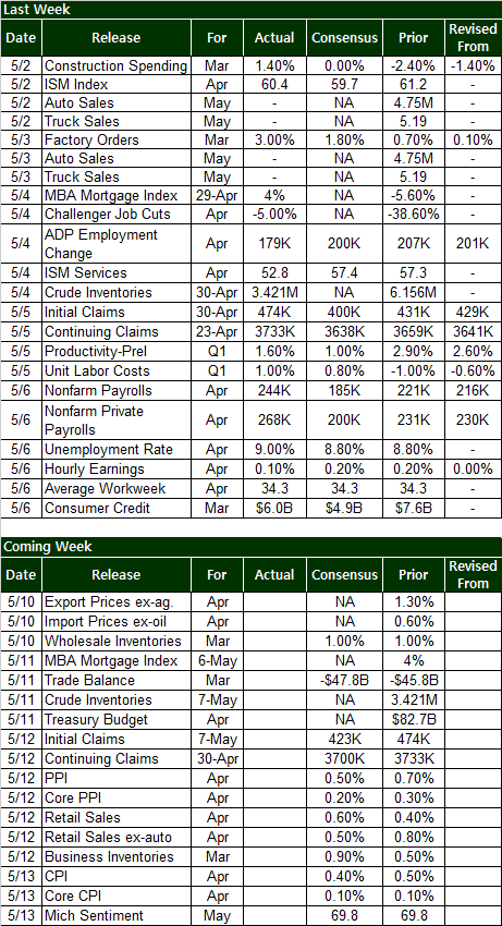
Clearly it will be a lighter week in terms of the amount of data, but what we’re getting will really round out the picture of the current consumer experience. The thing is, there’s nothing really hard-hitting until late in the week. Then the floodgates open.
* Thursday: Look for a slight dip in new and ongoing unemployment claims levels, and a tempered – yet still positive – produce inflation rate. The pros are also looking for another modest increase in retail spending.
* Friday: Consumer inflation is also expected to be positive, yet more muted than March’s price-swell. The Michigan Sentiment Index should come in roughly even with last month’s reading.
All in all we’re seeing a slightly net-bullish economic scenario here, but nothing more than that. Stocks can get by on this activity level, but they can’t thrive like this.
Stock Market
All told, the market lost 1.7% last week, just a couple of days after hitting new 52-week highs; so much for the ‘buy new highs’ theory.
And what’s next? Yes, earnings growth so far has been solid, but that’s no surprise, and not super relevant in the near-term. The 6.6% pop since mid-March priced good Q1 earnings in, and the 31% rally over the last ten months has priced in a sting series of earnings growth. How much more growth can the market reflect?
So, the ancient long-term versus short-term argument is stirred up again. In the long run, the market reflects fundamentals. In the short run though, the market reflects fear and greed, and bounces around a little irrationally (which is where we make most of our ‘trading’ money). And in the short run, it’s the bears that have the current edge.
It should come as no surprise to see where the S&P 500 rolled over – just as (actually a little after) the upper Bollinger band was brushed early last week. Given the way the Bollinger bands have been boundaries for the SPX for so long though, odds are that we’ll at least see a test of the lower band line at 1275. If the index could just make a close under the 20-day moving average line at 1338 though [which strangely seemed to be a support level on Friday], that downside outlook would be much easier to adopt.
Along those same lines, the CBOE Volatility Index (VIX) (VXX) (VXZ) has its own hump it needs to get over before the bears can really dig in…. the 50-day moving average line (purple) at 17.30. It’s been a ceiling since mid-April. The VIX is in an uptrend though, and that small step could actually be a very big step, especially considering that the next ceiling for the VIX isn’t until the 24-ish area. That amount of room could allow for a pretty big slide from the S&P 500… to right about 1275.
SPX & VIX Daily Chart

Not that it’s all that telling, but here’s a look at the weekly chart of the S&P 500 as well. Broadly, you can see how the market’s been slowly losing momentum, and how the VIX has made a floor around 14.8, which is still in play.
SPX & VIX Weekly Chart

Sector Performance
Wow – what a difference a week makes. Energy (XLE) stocks fell apart at the seams on the drastic plunge in oil prices, and telecom (XTL) and transportation (XTN) have started to sneak up as a leader. And, healthcare (XLV) is still raging. All are trends that seem to have some longevity too, which could make for a slightly more fruitful spring/summer period.
We do expect energy stocks to bounce back at least a little after such a bid dip. The era of energy stocks leading the market, however, seem to b over for the time being.
Sector Performance Since 3/16/2011

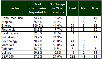
Earnings Scoreboard
With 88% of the S&P 500ââ,¬Â˛s companies having reported last quarter’s earnings, earnings season is on its final inning. And, it’s been a pretty good one. The average Y.O.Y. increase is rolling in at 21.5%, led by energy’s average 41% improvement and the materials (XLB) sector’s 56.8% increase, and dragged down by the 0.5% decline in income from the utilities (XLU) sector. The fact that just as many utility companies missed estimates as beat them is a little scary.
The overall award doesn’t go to the energy sector though, which actually had a pretty poor beat/miss ratio. Basic materials doesn’t get it either. The most impressive group for Q1 on a macro level goes to the industrial (XLI) names, with a 35% improvement in Y.O.Y. profits, and with nearly 80% of its companies topped forecasts.
Q1-2011 Earnings Scoreboard, by Sector
Price Headley is the founder and chief analyst of BigTrends.com.
|
|


 Free Festival of Traders Videos