| Nasdaq Breakdown, Mid-Caps Outperforming |
| By Price Headley |
Published
03/21/2011
|
Options , Stocks
|
Unrated
|
|
|
|
Nasdaq Breakdown, Mid-Caps Outperforming
Last week was the second losing week in a row, and the third loser in the last four. Though the S&P 500 (SPX) (SPY) only fell 25.07 points (-1.9%), and managed to push off the lows of the week, it’s becoming clear that the bulls are facing more and more of a struggle.
But is the struggle a done deal? We’ll discuss it below, but first, a run-down of last week’s and this week’s big (market moving) economic data.
Economic Calendar
The nation’s factories were mostly busier last month, though not leaps and bounds busier. The Empire Manufacturing Index swelled from 15.4 to 17.5, industrial production fell by 0.1% (but is still near multi-year highs), and capacity utilization held fairly steady at 76.3%.
And, prices are going up accordingly, for those factories as well as consumers. The Producer Price Index grew another 1.6% in February, while the Consumer Price Index was up 0.5%. On a core basis, respectively, inflation was up 0.2% and 0.2%. The ‘inflation rate’ now stands at 2.11%.
Initial claims as well as ongoing unemployment claims are still in downtrends as well, with the former falling to 385K a week ago, and with the latter sinking to 3.706 million two weeks ago.
The only red alert situation came on the construction front, as building permits for February fell to 517K from 563K. Housing starts tumbled from 618K to 479K.
Here’s the rest of the story.
Economic Calendar

There’s a little less on the menu for the coming week, though what’s on the schedule will really round out the housing construction picture. We’ll hear existing home sales on Monday (look for a move lower, to 5.05 million), new home sales on Wednesday (expected to roll in slightly higher at an annual rate of 288K), and an updated ‘average sale’ price as well.
On Thursday look for growth in consumer durable orders, with or without autos. On Friday we’ll get the final Michigan Sentiment Index level for March, which at the expected reading of 68.2 will fall in well under February’s 77.5.
NASDAQ Composite
Just to keep things fresh – and because it’s the more interesting of the two this week – we’re going to dissect the NASDAQ Composite (COMP) (ONEQ).
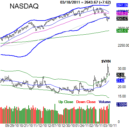
Yeah, you could make the argument that we ended things on a positive note, with a gain on Thursday and then another small one on Friday. Neither higher close was exactly a show of strength though…. more like a dead cat bounce following Tuesday’s catastrophic 2.0% dip. Indeed, Thursday’s and Fridays bars each point to more bearish problems ahead, as each close was well under the open, and well under the high. In fact, with the closes actually being near the low for the day, there’s a slight sense that folks were using that strength as a small exit window.
That said, the red flag isn’t so much that we saw weak closes and a loss for the week. It’s what the composite didn’t do that’s so rattling.
See the lower Bollinger band (blue) at 2645? From the very beginning of the bull market until now, that lower band line has been a support level – a rebound point – for every major dip. This time though (so far), it hasn’t been. That’s not to say the NASDAQ won’t be able to push up and out of this rut this week. But, the more damage that is done, the more likely it is that more damage will be done.
One of the extra nails in the coffin, however, is the fact that the composite has also closed under its 100-day moving average line for the first time since September.
To see one or the other is a problem. To see both of these bearish signals pop up at the same time in the shadow of an unmerited 27% rally though, isn’t something to dismiss.
Nasdaq Comp & VXN Daily Chart

As it stands right now, the composite has fallen 7.2% from its peak. It certainly may seem like more, but in the grand scheme of things that’s only about half the loss of a normal correction [we've been spoiled]. A move to the 200-day moving average line (green) at 2465 would translate into a 13% correction, which is more in line with the normal pullback. And, with an ‘organic’ support area waiting there for it, that would actually be the healthiest of likely moves here…. in the long run.
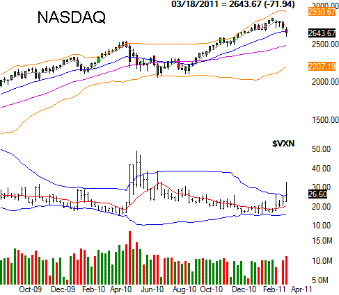
Since we’ve been adding the weekly chart of the SPX, we’re going to also add a weekly chart of the NASDAQ – just for perspective. When we take this step back and look (and gain some perspective), the market’s vulnerability after such a runup really stands out. It’s also on the weekly chart that we can see how the Nasdaq 100 Volatility (VXN) is trending upward now… more so than we can chalk up to last week’s expiration.
Nasdaq Comp & VXN Weekly Chart

It’s worth mention that even though the other major indices haven’t fallen under the support lines at their lower bands or 100-day averages, they don’t look any healthier than the NASDAQ does. And, given that the NASDAQ Composite tends to lead the market both up and down, its recent breakdown is something of a shot fired across the bow.
Style Comparison
Normally we’d add in a look at how each sector performed over the past week, and what sort of trade-worthy sector trends are taking shape. But, when stocks are dipping into the red ink like they have been the last four weeks, all sectors get hit pretty hard; pointing out a leader or laggard is a tad pointless.
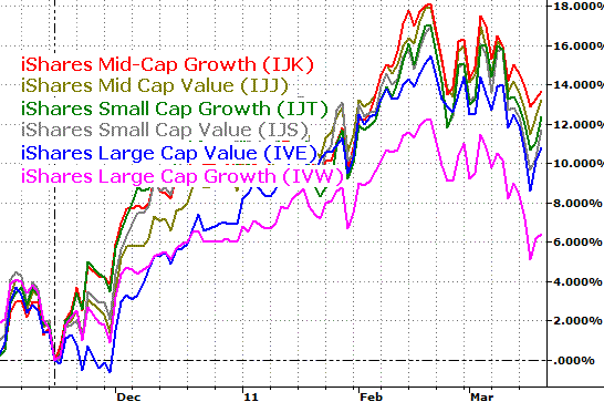
On the other hand, there’s some value is taking a step back and looking at which market cap and style groups are leading and lagging, and how this race may be changing shape. At the very least you could find an ETF to short, or pinpoint the right inverse ETF to own. We’re using the various iShares Growth/Value Market Cap ETFs here (IJK) (IJJ) (IJT) (IJS) (IVE) (IVW).
Well as it turns out, though no size/style group has been immune to the dip, each group has maintained its relative position… meaning mid caps (and growth in particular) are still leading the way, and large caps (growth in particular) are dragging the bottom.
Though this dynamic is supposed to change at this point in the bull market, it hasn’t. And, you’re far better off responding to what the market “is” doing than what it “should be doing”.
We have to assume these relative strength positions will hold up through a correction and any subsequent rebound until we have a clear reason not to think so.
Style Performance – Since 11/16/10

Price Headley is the founder and chief analyst of BigTrends.com.
|
|