With the recent rebound in the stock market, the S&P 500 Index is quickly coming upon its 100-day moving average.
With the recent rebound in the stock market, the S&P 500 Index (SPX) is quickly coming upon its 20-week (or 100-day moving average). Below is a graph of the SPX and its 100-day moving average (red trendline). This intermediate-term trendline has been an invisible hand for the equity market over the last several months. In fact, since the SPX broke below its 100-day moving average in June 2008, this widely-followed benchmark has been unable to crack this trendline on an upside move. In other words, the 100-day moving average has been an area or resistance. The yellow box in the graph below shows the former price support for the SPX. This former support could now be a wall of defense for rushing bulls. Thus, the bulls have converging resistance in the days to weeks to come.
S&P 500 Index Chart 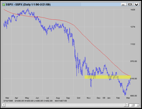
When looking through sector charts, it is always interesting to not only look at the relative strength comparisons (i.e. short-term returns of sector relative to SPX), but also how are the technical trends stacking up relative to moving averages. For example, the SPX is approximately three percent below its 100-day moving average. How do differing sectors indexes and exchange traded funds (ETFs) compare to their respective 100-day moving average?
In the accompanying table, we have a list of 25 sector indexes and exchange traded funds (ETF) that represent various industries. Along with the name of the index, we include the current price of the underlying instrument (at the time of the writing), the level of the corresponding 100-day moving average, and the percentage above or below the underlying instrument isrelative to its 100-day moving average. Green highlighted cells depict sectors that are above their respective 100-day moving average. Red highlighted cells show sectors that are below their 100-day moving average. 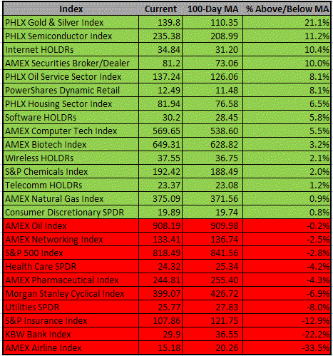
Leading the sectors above their 100-day moving average is the PHLX Gold & Silver Index ($XAU). The XAU is 21% above its 100-day moving average. The XAU is the only index that ismore than 20% above its 100-day moving average. Given the economic uncertainties and the influx of governmental spending, inflation hedging instruments like gold have benefitted by the Obama administration's policies.
XAU Chart 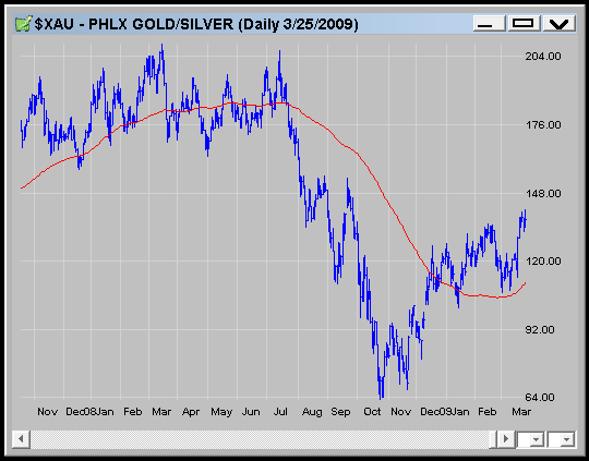
During the recent market rebound, the PHLX Semiconductor Index (SOX) has been able to use the bullish tailwinds to overtake its 100-day moving average for the first time since May/June 2008. Now, the semiconductors are trying to overtake the 230-235 area that has been giving the index fits the last handful of months.
SOX Chart 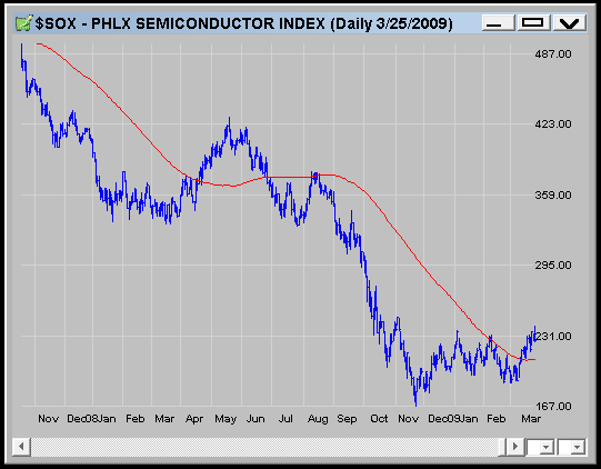
The Internet HOLDRs Trust (HHH) has been making a series of higher lows since finding a bottom in November. Similarly to the SOX, this most recent upleg has pushed the HHH well above its 100-Day moving average.
HHH Chart 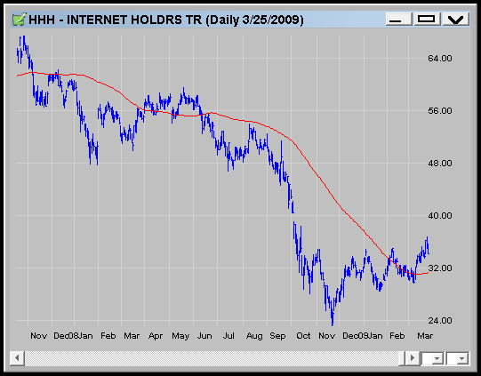
Looking at the laggards (using the percentage below 100-day moving average), the AMEX Airline Index (XAL) has failed miserably to take advantage of the most recent market rally. Could a double-bottom be forming? It will be interesting to see how airlines do if the economy picks up, which usually will be accompanied by rising oil costs. Can this industry recover?
XAL Chart 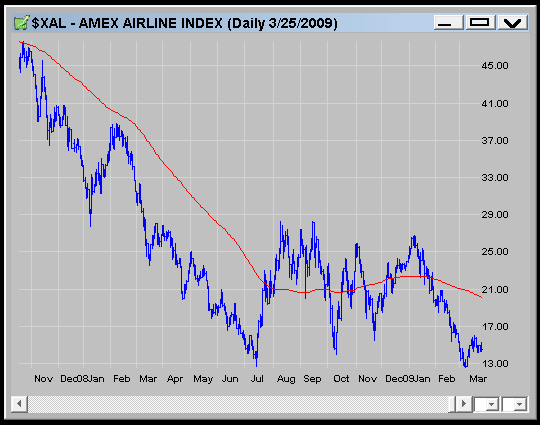
The 100-Day Simple Moving Average on the S&P 500 Index (SPX) mentioned above is currently sitting around 840 -- keep this in mind if the short-term rally continues and we approach that Moving Average and the key round 850 strike.
Price Headley is the founder and chief analyst of BigTrends.com.